One Photo, A Hundred Faces: The Hidden Machine Reshaping Your Memories
You took the photo. You were there. You know what the light looked like, how your mom's dress caught the afternoon sun, how the whole scene had that golden-hour warmth you almost never manage to capture. And when you looked at it on your phone right after, it was perfect.
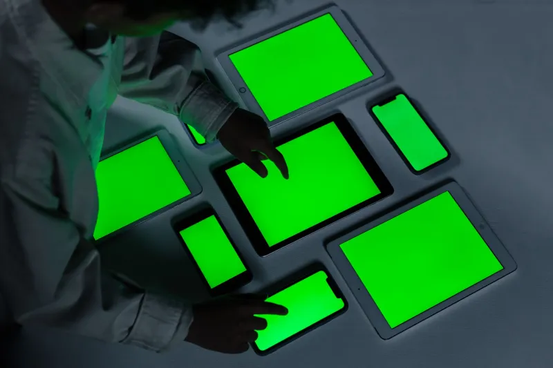
Then you opened it on your tablet. Then your laptop. Then your old desktop in the home office.
Something was different each time. You probably couldn't name it. Maybe the colors felt slightly cooler, or the shadows went a little deeper, or the whole thing just looked... flatter. You shook it off. Screens are different, right? That's just how it works.
Except that explanation is a lot more complicated than most people realize.
The Invisible Processing Layer You Never Agreed To
Every device you own — your phone, your tablet, your laptop, your smart TV — runs its images through a processing pipeline before they ever reach your eyes. This isn't a bug. It's an intentional design choice baked into hardware and software at a level most users never see.
Phone manufacturers tune their display processors to make images pop. Apple's iPhones use something called True Tone combined with a P3 wide color gamut, which means colors are rendered with a broader, richer palette than a lot of other screens can even produce. Samsung takes a different approach — their AMOLED panels push contrast and saturation in ways that look vivid and punchy but technically diverge from what the original file contains. Google's Pixel line applies its own computational photography stack, which doesn't just affect how photos are taken — it affects how they're displayed.
And then there's the compression problem.
What Compression Is Actually Doing to Your Photos
When you share a photo — upload it to iCloud, send it through Google Photos, text it to a friend, post it anywhere — it almost certainly gets compressed. Sometimes heavily. JPEG compression in particular works by identifying and discarding visual information the algorithm decides you won't notice. The problem is that "won't notice" is a subjective call made by an engineer at a company you've never spoken to.
What gets thrown away isn't random. Fine textures go first. Subtle gradients in skies and skin tones get smoothed out. Details in shadows and highlights collapse into flat zones. The photo that lands on your laptop after traveling through a cloud service isn't the photo that left your phone. It's a close approximation — a reconstruction — and how close it is depends entirely on which service handled it, what compression level they applied, and what device is now trying to render it.
Apple compresses differently than Google. Google compresses differently than Dropbox. Dropbox compresses differently than the MMS system your carrier uses when you text a photo. Each stop on the journey leaves a mark.
Your Display Is Lying, Politely
Beyond compression, there's the display calibration issue — and this one goes deep.
Manufacturers calibrate their screens to specific color profiles. Some target sRGB, which is the older standard and what most of the web still technically assumes. Others target DEC-P3, which is wider. Some budget laptops ship with panels that cover barely 60% of sRGB, meaning they're physically incapable of showing you the full range of colors in your photo. They just quietly substitute.
Operating systems add another layer. Windows and macOS handle color management differently, and not all apps respect color profiles the same way. Open the same photo in Chrome versus Firefox versus the native Photos app on a Mac and you might see three subtly distinct versions — same file, same machine, different interpretations.
None of this is disclosed to you anywhere obvious. There's no pop-up that says "hey, this image looks 12% cooler on your device than it did on the one that took it." It just happens.
The Memory Problem Nobody Talks About
Here's where it gets genuinely unsettling if you sit with it long enough.
Photographs are how most Americans preserve memory. We reach for them when we want to remember what something looked like — a person's face, a place we visited, a moment we don't want to lose. We trust them as documents.
But if every device renders that document differently, what exactly are we trusting? The photo of your grandfather at his last birthday might look warm and soft on the phone where you took it, and clinical and slightly washed out on the laptop where you look at it most often. Your brain is building its memory of that afternoon around whatever version it sees most. That's a strange thing to think about.
Photographers who work professionally understand this problem — it's why serious photo editing happens on calibrated monitors with hardware color profiles. But for everyone else, the assumption is that a photo is a photo. It looks like what it looks like. That assumption is wrong, and it's wrong in ways that are invisible by design.
What the Companies Say (and Don't Say)
The major players — Apple, Google, Samsung, Microsoft — don't hide the fact that their devices process images. They advertise it. "Computational photography" is a selling point. "True Tone" is a feature. "Vivid display mode" is something you choose in settings.
What they don't advertise is that all of this processing means your photos are not stable objects. They're dynamic, device-dependent experiences. The same file produces different visual outputs depending on where it's being read, and those differences accumulate across a lifetime of photos stored across multiple services and viewed on hardware that gets replaced every few years.
You're not looking at your memories. You're looking at your device's interpretation of your memories. And every device has a different opinion.
Getting Closer to the Source
There are things you can do to close the gap, even if you can't eliminate it entirely. Shooting in RAW format rather than JPEG preserves more of the original data before any processing happens. Calibrating your monitor — even a basic calibration through your operating system's built-in tools — gets you closer to a standardized output. Using photo viewers that properly respect embedded color profiles helps. Avoiding heavy-compression sharing platforms for photos you actually care about matters too.
But most people won't do any of that, and honestly, most people don't know they'd need to. The systems are designed to feel seamless. The processing is meant to be invisible. You're supposed to feel like you're just looking at a photo.
You're not, though. You're looking at a version. And somewhere in the gap between versions, something real is getting lost.